Valinor Brand Standards & Identity
Valinor is the go-to-market engine for the world’s best technologists building products for defense, the broader U.S. government and their allies.
I worked with Valinor to create their visual identity from the ground up, iterating to find the right logo and building out their brand look and feel. What we came up for reflects their mission driven core and suits their government-oriented market.

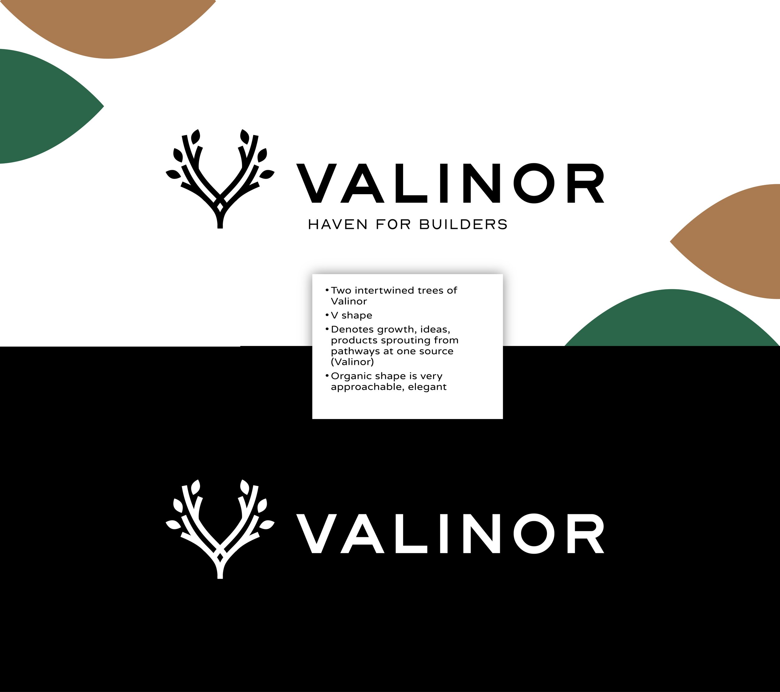

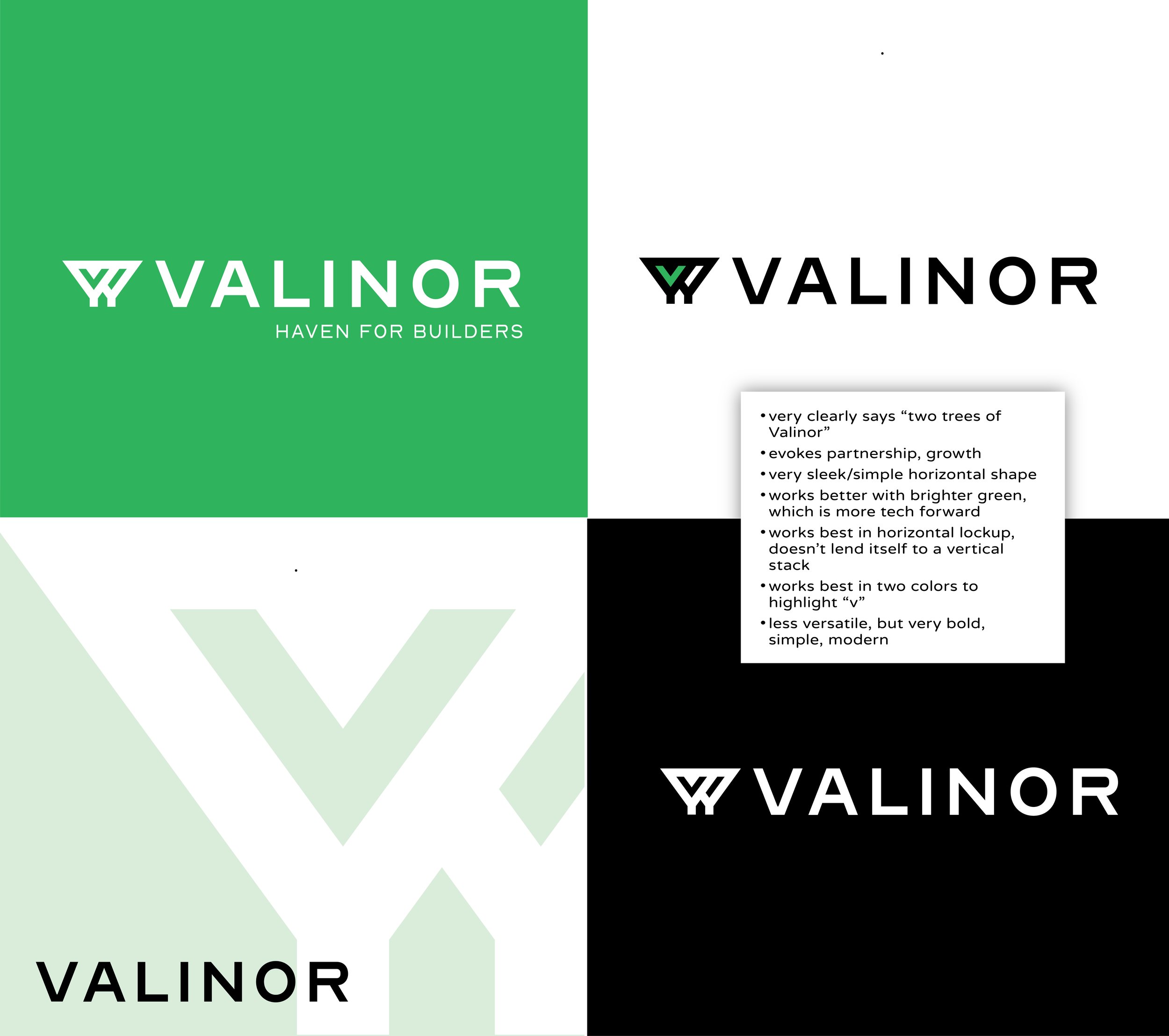

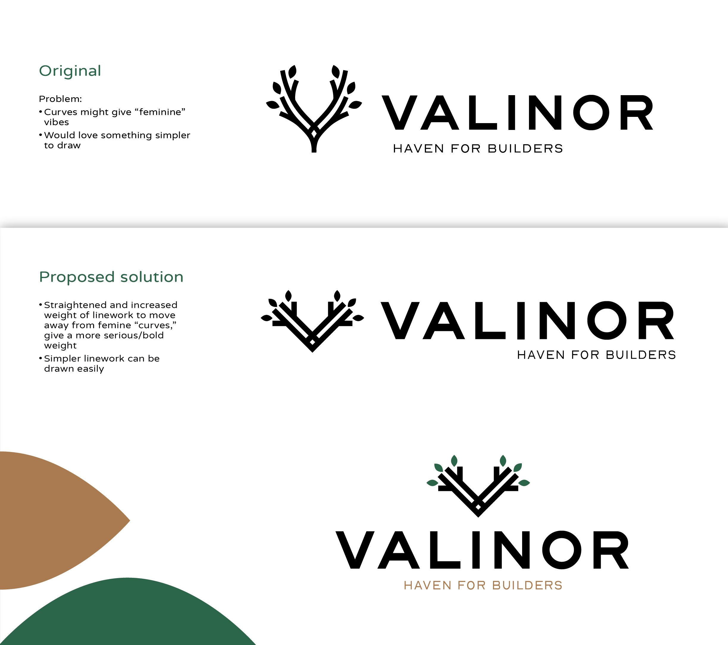
The name “Valinor” comes from the Lord of the Rings trilogy. The island of Valinor is home to Valar, known as Middle-earth’s god-like beings. It is also home to the two trees of Valar. We knew we wanted the Valinor logo to call back to these trees and bring in themes of growth and partnership.
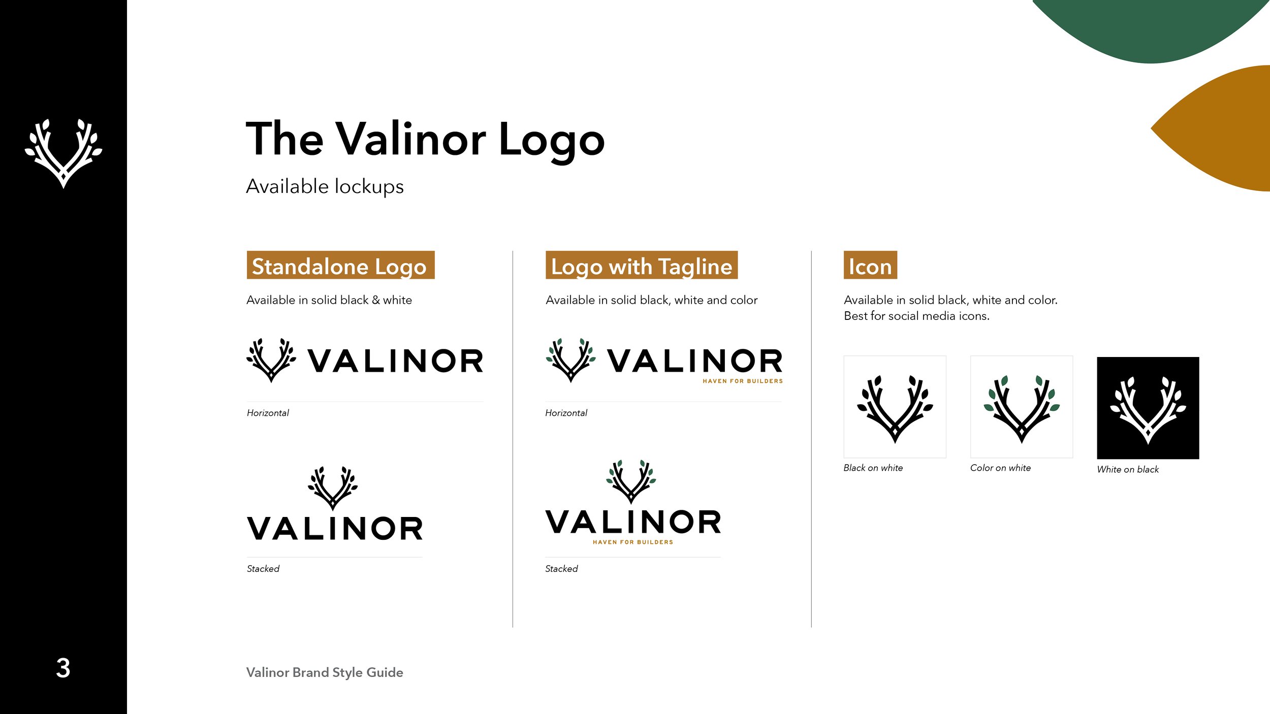
Valinor, the company, serves as a haven for builders, providing the framework needed to bring their products to market. The partnership between Valinor and the companies they support is symbolized in the twisting branches of our final mark, and the branches serve as pathways to bringing their products to life. The leaves sprout from the support of the tree, but stand strongly on their own, as do the unique products which come from the Valinor framework.
Final Mark
